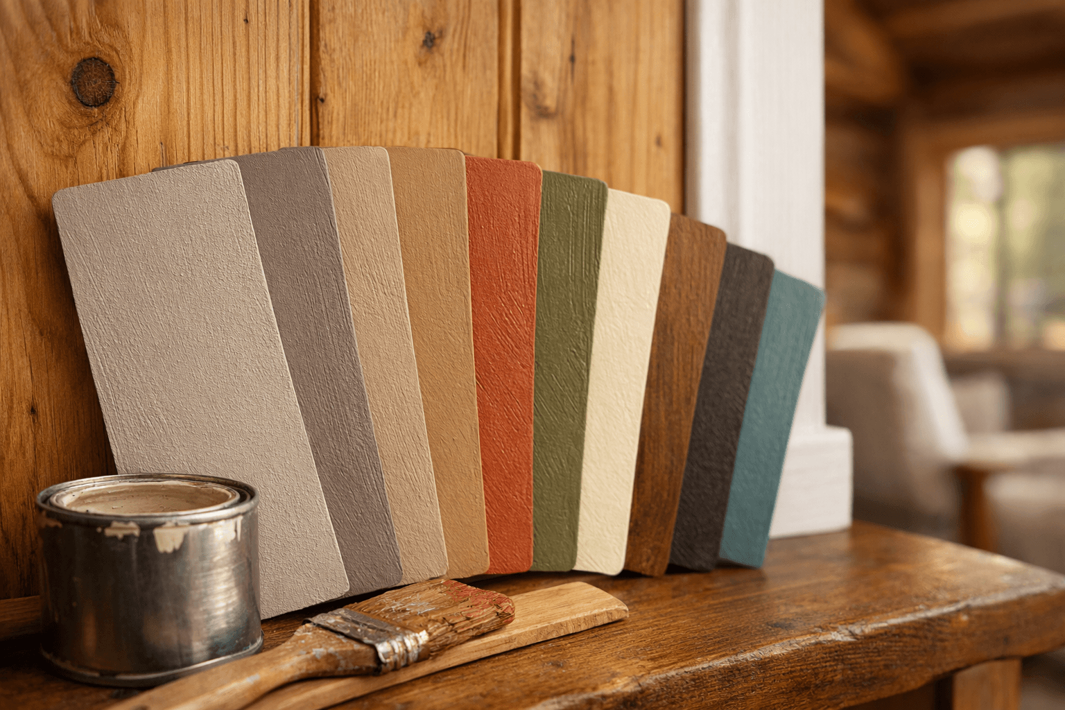
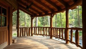
Paint chips lie. That warm greige that looked perfect under the fluorescent lights at the hardware store can turn muddy green the second it hits your living room wall at 4 p.m. The best interior colors for houses in 2026 aren’t really about chasing a trend color at all — they’re about picking shades that respond well to your actual light, your ceiling height, and (if you’re building a cabin like I am) the wood already on your walls.
This year’s palette leans warmer and earthier than the cool grays that dominated the last decade. That’s good news if you’ve got wood paneling or log walls, because warm tones finally play nice with wood instead of fighting it.
Warm Neutrals Are Replacing Cool Grays This Year
Warm neutrals like greige, mushroom, and soft taupe are the safest bet for 2026 because they read as fresh without going cold or clinical. Cool grays had a decade-long run, but they tend to look sterile against wood trim and can turn blue-ish under weak light.
Greige and Mushroom Tones
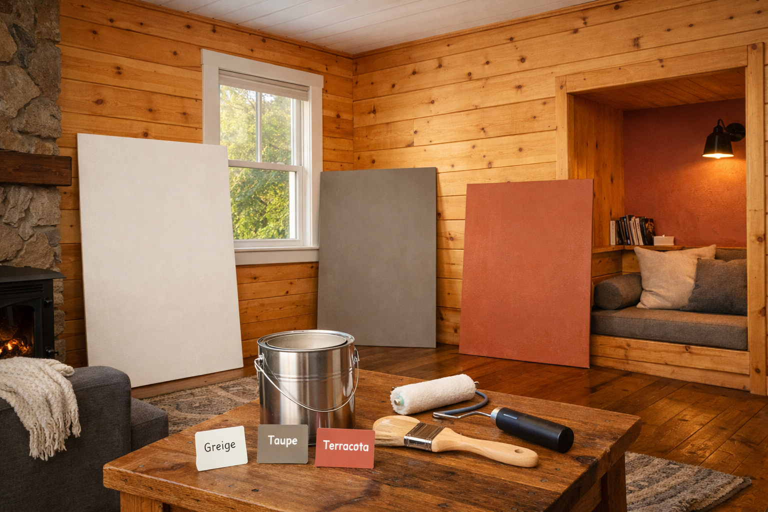
Greige (gray plus beige) and mushroom tones sit in a sweet spot. Something like Sherwin-Williams Perfect Greige or Benjamin Moore Balboa Mist works in almost any room because it shifts warm or cool depending on your light source, but never goes fully in either direction. In a cabin with pine paneling, these tones bridge the gap between the wood’s orange undertone and any white trim you’ve got.
Why This Matters for Wood-Heavy Rooms
Cool gray next to natural wood often looks like two rooms fighting each other. Warm neutrals let the wood grain stay the visual focus instead of competing with the wall color for attention. If you’re unsure, test a sample next to your actual trim boards, not just on drywall.
Earthy Terracotta and Clay Give Small Rooms Personality
Terracotta and clay tones are one of the biggest color moves for 2026, and they work surprisingly well in small spaces despite being “bold” colors. A muted clay like Farrow & Ball Red Earth or a dusty terracotta adds warmth without the visual noise busy patterns bring.
The trick is saturation. A soft, chalky terracotta reads as cozy in a 200-square-foot cabin loft; a bright, saturated orange-red will feel like it’s closing in on you. Go for anything with a decent amount of gray or brown mixed in — the paint can labeled “clay” or “adobe” rather than “rust” or “pumpkin” is usually your safer pick.
These colors pair especially well with darker wood tones like walnut or stained pine, since both sit in the same warm family. If your cabin has lighter, more yellow pine, lean toward a dustier terracotta so the two don’t clash in undertone.
Navy, Forest Green, and Moody Colors Work Better Than You’d Think in Small Spaces
Moody colors don’t automatically make small rooms feel smaller — in fact, a dark, saturated color on all four walls can make a low-ceilinged room feel intentional instead of cramped, because it removes the contrast lines your eye uses to judge size. Navy and deep forest or olive green are the two standout moody choices for 2026.
Navy Blue for Cabin Bedrooms
A navy like Benjamin Moore Hale Navy on a bedroom’s walls, paired with warm wood ceiling beams, creates a den-like feel that a lot of cabin owners actually want. It photographs well too, which matters if you’re planning to list the place as a rental down the line.
Forest and Olive Green for Living Areas
Deep forest or olive green ties a cabin to its surroundings in a way gray never will. These tones also hide the inevitable scuffs and dust that come with off-grid living better than a pale wall color does.
One genuine caution here: moody colors need real light to breathe. A north-facing cabin room with one small window can feel like a cave in navy or dark green unless you add layered lighting — a floor lamp plus overhead fixture, not just one bare bulb.
Matching Wall Color to Wood Tone and Room Size
Matching your wall color to your existing wood tone is the single most important step for cabin and tiny-home interiors, more so than chasing whatever’s trending. Suburban homes with drywall and big windows can pull off almost any color; a cabin with pine paneling and one small window can’t.
Small Space Color Strategy
Skip stark white. It’s a common myth that white brightens a small, dark cabin — in practice it often looks flat and slightly gray under weak bulbs, and it does nothing to warm up the space. A soft off-white with a warm undertone, or a light greige, does the brightening job without the cold feeling.
Testing Colors in Real Light
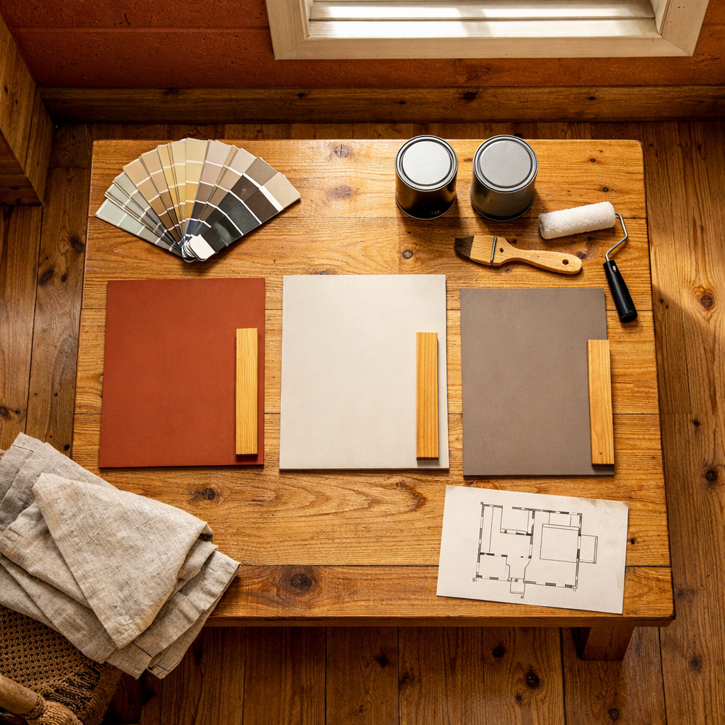
Buy a sample pot and paint a 12-inch square directly on your wall, then look at it in morning light, midday, and after dark under your actual bulbs. Cabin light is usually dimmer and warmer (from incandescent or warm LED bulbs) than a suburban home’s daylight-balanced lighting, and that shifts how a color reads more than people expect.
Here’s how the main 2026 color families stack up for a cabin-style interior:
Color Family
Best Wood Pairing
Small Room Feel
Light Needs
Warm greige/mushroom
Pine, cedar
Opens up the room
Works in low or bright light
Terracotta/clay
Walnut, stained pine
Cozy, not cramped
Best with warm bulbs
Navy
Oak beams, dark trim
Feels intentional
Needs layered lighting
Forest/olive green
Any natural wood
Ties room to outdoors
Needs at least one good window
Off-white (warm)
Light pine, birch
Brightens without cold feel
Flexible
Matte vs. Eggshell: Which Finish Actually Suits a Cabin
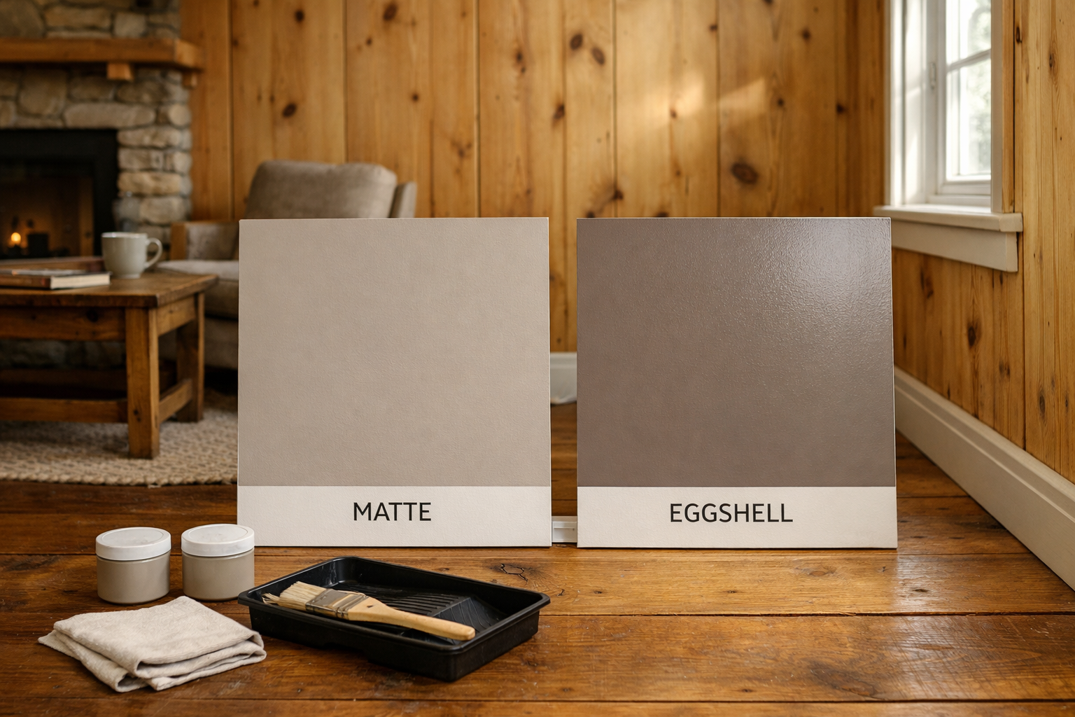
Eggshell beats matte for most cabin walls because it wipes clean without the flat, chalky look that shows every fingerprint mark near a wood stove or kitchen area. Matte finish looks great in a photo, but it scuffs fast and it’s hard to spot-clean without leaving a shiny patch behind.
I’d reserve matte for ceilings and low-traffic bedroom walls, where nobody’s leaning against the paint. For anything within reach of daily life, a kitchenette, entryway, or the wall behind a bench, eggshell or even satin holds up to the bumps and grease that come standard with small-space living.
If you’re planning a full interior repaint for a build, it’s worth reading up on wood prep and treatment before you touch a wall with color; a lot of cabin builders (myself included, over at Cabin Lodger) have learned the hard way that raw or under-sealed wood soaks up paint unevenly and wastes half a gallon before you notice.
Here’s a rough order of operations for painting cabin walls that actually holds up:
Clean and lightly sand any wood paneling to remove dust and resin.
Seal knots and raw wood with a stain-blocking primer.
Test your color sample on the actual wall, not a scrap board.
Paint ceilings and trim first, then walls.
Apply two coats of eggshell or satin in high-traffic areas.
Let each coat cure a full 24 hours before touching or leaning furniture against it.
Frequently Asked Questions
What’s the best interior color for a small, dark cabin?
A warm greige or soft warm off-white, not stark white. White looks cold and flat under weak bulbs, while warm neutrals bounce light around without draining the room’s color.
Do dark colors make a low-ceilinged room feel smaller?
Not necessarily. A single dark, saturated color like navy or forest green on all walls can make a small room feel cohesive rather than cramped, especially with layered lighting rather than one overhead bulb.
Should I match paint color to my wood paneling’s undertone?
Yes, always. Yellow-toned pine needs cooler-balanced neutrals or dusty terracotta, while reddish walnut or cedar pairs better with deeper clay, navy, or olive tones without clashing.